Federal
Migrating Medicaid.gov to the US Web Design System
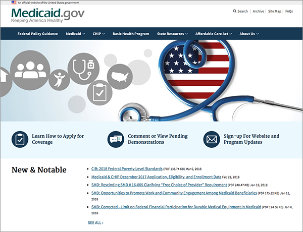
How we moved Medicaid.gov onto USWDS without disrupting the site's established visual identity
The problem
Medicaid.gov had accumulated years of custom CSS and bespoke component patterns that worked, but at a cost. Every new feature required designers and developers to rediscover conventions that had no documented source of truth. Accessibility compliance was inconsistent — some pages were thoroughly audited, others had never been reviewed. And as CMS began pushing toward a unified visual language across its portfolio of federal health sites, Medicaid.gov's one-off codebase made alignment increasingly difficult to maintain.
The mandate was to migrate the site's frontend to the US Web Design System. The constraint was equally clear: the site's established look and feel — its color palette, typography scale, and page structure — had to be preserved. This was not a redesign. Users and stakeholders had no appetite for visual disruption. The goal was structural coherence underneath a familiar surface.
Understanding what we had
Before touching any code, I conducted a full component inventory of the existing site. Working with the frontend team, we catalogued every distinct UI pattern in production: headers, navigation states, card variants, data tables, alert banners, accordions, and the custom data visualization components used across policy and eligibility content pages.
Each component was evaluated against its USWDS equivalent along two dimensions: how close was the visual output to our existing design, and how much custom theming would be required to close the gap. Most components mapped cleanly — USWDS's accordion, card, and table components were structurally identical to what we had. A handful of patterns, particularly the data-heavy policy comparison tables and the site's persistent secondary navigation, had no direct USWDS analogue and would need to be built as custom components layered on top of USWDS tokens.
Preserving the design through theming
USWDS is built around a token system that controls color, typography, spacing, and sizing at a global level. Rather than overriding styles with custom CSS after the fact — which would have recreated the maintenance burden we were trying to escape — I worked directly within the USWDS theming layer to map Medicaid.gov's existing design decisions to their token equivalents.
The site's blue-dominant brand palette translated directly to USWDS color tokens with minimal compromise. The primary action color, link color, and header background all landed within acceptable delta of the originals using USWDS's built-in palette. Typography required more deliberate mapping: the site used a custom type scale that didn't align exactly to USWDS's default modular scale, so I worked with the frontend team to define a custom type scale configuration that preserved the size relationships designers and content editors had built around.
The result was a theme file that expressed the full Medicaid.gov visual identity in tokens — meaning future changes would be made in one place and cascade correctly, rather than scattered across hundreds of overrides.
Accessibility as a migration benefit
One of the clearest wins from moving to USWDS was inherited accessibility. USWDS components are built against WCAG 2.1 AA as a baseline, with many components reaching AAA on color contrast. By migrating to USWDS components, we resolved a significant portion of the site's outstanding accessibility issues without any dedicated remediation effort.
We ran a targeted audit before and after the migration using a combination of automated tooling (axe) and manual keyboard and screen reader testing. Pre-migration, the site had 43 distinct accessibility violations across its core templates. Post-migration, that number dropped to 11 — all in the custom components that fell outside the USWDS component set, which we then addressed individually.
Rollout approach
Rather than a big-bang switch, we migrated template by template, starting with the lowest-traffic pages and working toward the highest. This gave the team time to find and resolve token mapping edge cases before they affected the site's primary entry points. It also meant that stakeholders could review pages side-by-side against the prior design before each section went live, which built confidence that the visual continuity commitment was being honored.
Internal content editors were briefed on the new component vocabulary before launch. Because the underlying look and feel hadn't changed, the training focused on structural changes — how to use USWDS-native patterns for things like alerts and accordions — rather than any relearning of visual conventions.
Outcome
The migration was completed across the full site over approximately four months. Post-migration, the frontend codebase shrank by roughly 30% in custom CSS — a direct result of removing component-level overrides that USWDS's theming layer now handled centrally. Accessibility violations dropped by 74% from baseline. The site joined the broader CMS design system ecosystem, making future alignment with healthcare.gov and other CMS properties significantly easier to maintain without forking the design.